The Ultimate Guide to Mixing & Matching Patterns in Home Decor
The Ultimate Guide to Mixing and Matching Patterns in Your Home Decor offers expert advice to create visually appealing spaces by strategically combining various patterns, considering scale, color palettes, and balancing bold designs with neutral elements for a cohesive and stylish look.
Want to transform your living space into a stylish haven? The Ultimate Guide to Mixing and Matching Patterns in Your Home Decor offers a simple and effective way to elevate your home’s aesthetic.
Understanding the Basics of Pattern Mixing
Mixing patterns can seem intimidating, but understanding the fundamentals makes it approachable. It’s about creating visual harmony by combining different designs thoughtfully. Let’s explore the core principles that will guide you in this creative endeavor.
Scale and Proportion
Varying the scale of patterns is crucial. Combine large-scale patterns with smaller, more intricate designs. This creates visual interest and prevents the space from feeling overwhelming. Think of it as a balanced ecosystem where different sizes complement each other.
Color Palette Cohesion
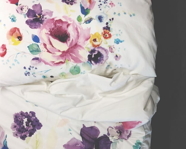
A unified color palette is the backbone of successful pattern mixing. Choose a few core colors that repeat throughout your patterns. This will tie everything together, even if the patterns themselves are quite different. Aim for a consistent base with coordinated accents.
- Start with a neutral base and build from there.
- Limit your color palette to 3-4 colors.
- Use color variations within the same family.
By focusing on both scale and color cohesion, you create a visual narrative that is both engaging and unified. This approach ensures that your pattern choices will complement one another, rather than clash.
Choosing Your Base Pattern
Every successful pattern mix needs a starting point. Selecting your base pattern thoughtfully sets the tone for the entire room. This anchor pattern will influence all subsequent choices, guiding your selection of complementary designs.
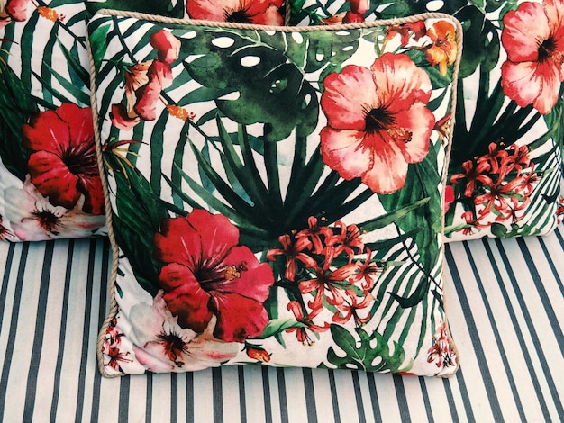
Large-Scale Florals
A large-scale floral print can serve as a bold and beautiful base pattern. These designs often incorporate a variety of colors, providing a broad palette to draw from for your other patterns. This approach adds a natural, organic feel to the space.
Geometric Statements
Geometric patterns, such as stripes, chevrons, or trellis designs, offer a structured and modern base. They bring a sense of order and can be easily paired with more whimsical or detailed patterns. A strong geometric foundation can ground the entire design.
The right base pattern acts as a visual anchor, setting the stage for harmonious and cohesive interior design. It provides a foundation for your creativity, allowing you to experiment with complementary patterns and create a personalized style that reflects your unique taste.
Layering Patterns Effectively
Layering patterns effectively is an art that balances visual excitement with overall harmony. It’s about creating depth and interest by strategically combining different patterns in a way that feels both curated and cohesive. Let’s delve into the techniques that will help you master this skill.
Mixing Geometrics and Florals
Combining geometric and floral patterns is a classic way to create visual contrast. A geometric pattern provides structure and order, while a floral print adds softness and organic movement. This pairing works best when the colors are complementary, creating a balanced and visually appealing contrast.
Incorporating Stripes and Solids
Stripes are incredibly versatile and can be used as a neutral pattern when mixed with more intricate designs. Solid colors also play an important role, offering a visual break and preventing the space from feeling too busy. Balance is key to achieving a sophisticated look.
- Use stripes as a transitional pattern.
- Incorporate solid colors to balance bolder patterns.
- Vary the scale of your stripe patterns.
Effective layering transforms a room from ordinary to extraordinary, creating depth, interest, and a sense of cohesive style. It’s about carefully selecting and arranging patterns to tell a visual story that resonates with your personal aesthetic. By understanding and applying these techniques, you can bring your interior design visions to life.
Balancing Bold and Neutral Patterns
Achieving balance is essential when mixing bold and neutral patterns. The interplay between adventurous designs and calming elements creates visual harmony, preventing the space from feeling either bland or overwhelming. Let’s explore how to strategically incorporate both to create a balanced and inviting atmosphere.
Using Neutrals as a Backdrop
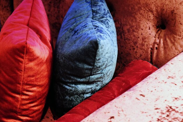
Neutral patterns, such as subtle textures or muted geometrics, can serve as an excellent backdrop for bolder designs. They provide a visual rest and allow the statement patterns to truly shine. This approach creates a sense of depth and sophistication in the room.
Strategic Placement of Bold Patterns
Strategic placement of bold patterns is crucial for maintaining balance. Use them sparingly, focusing on accent pieces like throw pillows, rugs, or artwork. This prevents the room from feeling too busy and allows the bold patterns to make a significant impact without overwhelming the space.
Balancing bold and neutral patterns is key to creating a visually appealing and harmonious interior. By carefully considering the interplay between these elements, you can create a space that feels both exciting and comfortable, reflecting your personal style with sophistication.
Considering Texture in Pattern Mixing
Texture adds another layer of depth and interest to pattern mixing. It’s about engaging not just the visual sense, but also the tactile, creating a more immersive and dynamic interior. Let’s explore how incorporating different textures can enhance your pattern mixing efforts.
Combining Smooth and Rough Textures
Mixing smooth and rough textures creates a tactile contrast that adds depth to the overall design. For example, pairing a smooth, patterned silk pillow with a rough, woven wool throw adds a layer of sensory interest. This interplay enhances the visual appeal and makes the space more inviting.
Using Texture to Define Patterns
Texture can also be used to define patterns. A raised pattern on a rug or a textured wallpaper can add subtle dimension without introducing a new color or design. This is a great way to add depth to a monochromatic scheme or to complement existing patterns without overwhelming the space.
- Incorporate textured fabrics like velvet or linen.
- Add textured accessories such as woven baskets or ceramic vases.
- Use textured wall finishes to add depth.
The integration of texture into pattern mixing elevates the overall design, making it more dynamic, visually interesting, and inviting. By considering how different textures interact, you can create a space that is both beautiful to look at and pleasing to the touch.
Common Mistakes to Avoid
Even with a solid understanding of pattern mixing principles, it’s easy to fall into common pitfalls. Recognizing and avoiding these mistakes can make the difference between a harmonious design and a chaotic mismatch. Here are some key errors to be mindful of.
Overdoing the Number of Patterns
One of the most common mistakes is using too many patterns in one space. This can create a sense of visual clutter and overwhelm the senses. Stick to a curated selection of patterns that complement each other, rather than trying to incorporate every design you love. Less is often more when it comes to pattern mixing.
Ignoring Scale and Proportion
Failing to vary the scale and proportion of patterns can also lead to a less-than-desirable outcome. Using patterns that are all the same size can make the space feel monotonous and flat. Ensure you have a mix of large, medium, and small-scale patterns to create visual interest and depth.
By understanding these common mistakes and taking steps to avoid them, you can elevate your pattern mixing efforts and create a space that exudes style, balance, and personal flair. Careful planning and attention to detail will help you achieve a harmonious and visually appealing design.
| Key Element | Brief Description |
|---|---|
| 🎨 Color Palette | Choose 3-4 colors as a base for cohesion. |
| 📏 Scale & Proportion | Mix large and small patterns for visual interest. |
| ⚖️ Balance | Use neutral patterns to balance bolder ones. |
| ✨ Texture | Incorporate texture to add another layer of depth. |
FAQ
▼
Yes, you can mix different styles. For instance, pair a modern geometric with a traditional floral to create an eclectic and personalized space.
▼
Select a pattern that you love and provides a broad color palette. A large-scale floral or a bold geometric can be a great starting point.
▼
A unified color palette is key. Choose 3-4 core colors that repeat throughout the patterns to tie everything together harmoniously.
▼
It depends on the space, but generally, stick to 3-5 patterns. Ensure they vary in scale and complement each other without overwhelming the room.
▼
Absolutely. Use smaller-scale patterns and lighter colors to prevent the room from feeling too enclosed. Balance bolder designs with plenty of neutral space.
Conclusion
Mastering the art of mixing and matching patterns can transform your home into a stylish and personalized sanctuary. By understanding the basic principles, choosing your base wisely, and carefully layering patterns, you can create a space that reflects your unique taste and brings joy to your everyday life.


