Top 5 Home Decor Color Palettes Trending in 2025
Discover the top 5 home decor color palettes set to dominate in 2025, ranging from calming neutrals to energizing brights, providing inspiration for refreshing your living spaces with the latest trends.
Ready to refresh your home with the latest trends? Let’s explore what’s trending now: the top 5 home decor color palettes for 2025, offering a fresh perspective on interior design and helping you create a stylish and inviting living space.
Embracing Earthy Tones: Nature’s Palette
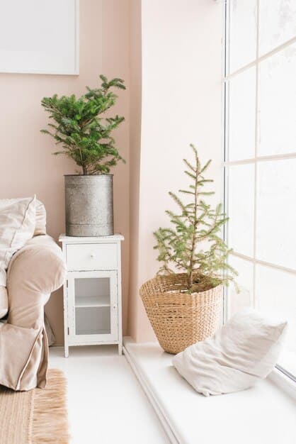
Step into a world of tranquility with nature-inspired earthy tones. These palettes bring the serenity of the outdoors inside, creating a calming and grounded atmosphere in your home.
The Allure of Browns and Greens
Browns and greens offer a connection to nature that is both soothing and grounding. These colors can transform any room into a serene escape.
Terracotta and Sage Combinations
Terracotta and sage green create a warm and inviting atmosphere, reflecting the colors of the earth and complementing natural light beautifully.
- Versatility: Works well in various rooms, from living rooms to bedrooms.
- Complementary: Pairs seamlessly with natural materials like wood and stone.
- Calming Effect: Promotes relaxation and reduces stress.
Earthy tones provide an excellent canvas for adding texture through materials like woven baskets, linen fabrics, and handcrafted ceramics. They are versatile and create a harmonious balance in any space. Whether you prefer a minimalist look or a more layered, bohemian style, earthy tones can adapt to your aesthetic.

Muted Pastels: Soft and Serene
Muted pastels are making a significant comeback, offering a soft and serene touch to interiors. These gentle hues create a peaceful ambiance, perfect for bedrooms, nurseries, and living areas.
The Return of Vintage Charm
Muted pastels evoke a sense of nostalgia and vintage charm, bringing a light and airy feel to any room.
Perfect Shades for Relaxation
Soft pinks, gentle blues, and creamy yellows are ideal for creating relaxing spaces where you can unwind and de-stress.
- Subtle Elegance: Adds a touch of sophistication without being overpowering.
- Versatile Pairing: Complements both modern and traditional decor styles.
- Light Enhancing: Brightens up spaces and reflects light beautifully.
When using muted pastels, consider incorporating tactile elements like plush rugs, velvet cushions, and sheer curtains. These materials enhance the sensory experience and add depth to the color scheme. Muted pastels also work well with metallic accents like gold or copper, which provide a subtle contrast and elevate the overall aesthetic.
Bold and Bright: Energize Your Space
For those who love to make a statement, bold and bright color palettes are the way to go. These vibrant combinations infuse energy and personality into your home, creating focal points and sparking joy.
The Power of Contrasting Colors
Contrasting colors like teal and coral, or yellow and navy, can create a dynamic and exciting atmosphere in any room.
By experimenting with bold patterns and unexpected combinations, you can create a space that truly reflects your personality and style.
- Eye-Catching: Immediately draws attention and adds visual interest.
- Mood Boosting: Enhances feelings of happiness and creativity.
- Personal Expression: Allows you to showcase your unique style.
Balance is key when working with bold colors. Use neutral backgrounds to anchor the space and prevent the colors from becoming overwhelming. Incorporate natural light and reflective surfaces to enhance the vibrancy of the colors and create a sense of openness. Consider using bold colors as accents, such as in artwork, cushions, or statement furniture pieces, to add pops of energy without committing to an entire room makeover.

Monochromatic Magic: Shades of Simplicity
Monochromatic color schemes offer a sophisticated and streamlined look, using different shades and tones of a single color to create depth and interest. This approach is perfect for creating a calming yet stylish environment.
The Sophistication of Single Color Schemes
Monochromatic schemes offer a cohesive and elegant look, providing a backdrop for interesting textures and accessories.
Layering Shades for Depth
Varying shades of the same color, such as different tones of gray or blue, add dimension and sophistication to your space.
- Elegant Simplicity: Creates a clean and refined aesthetic.
- Easy Coordination: Simplifies the decorating process.
- Textural Focus: Highlights the importance of textures and materials.
To avoid monotony, focus on incorporating a variety of textures and materials within the monochromatic scheme. Combine smooth and rough surfaces, such as velvet and linen, to create tactile interest. Incorporate metallic accents to add a touch of glamour and prevent the space from feeling flat. Layering different shades of the same color will also add depth and dimension, creating a visually engaging and harmonious environment.
Jewel Tones: Rich and Luxurious
Jewel tones bring a sense of opulence and drama to interiors. These rich, saturated colors evoke feelings of luxury and sophistication, making them ideal for creating statement spaces.
The Allure of Gemstone Colors
Colors like sapphire blue, emerald green, and ruby red add a touch of glamour and elegance to any room.
Creating a Sense of Opulence
Pairing jewel tones with luxurious materials like velvet, silk, and gold accents enhances the sense of richness and sophistication.
- Dramatic Impact: Makes a bold and unforgettable statement.
- Luxurious Feel: Evokes a sense of opulence and grandeur.
- Versatile Combinations: Works well with both modern and vintage decor.
Balance the intensity of jewel tones by using them in strategic areas, such as accent walls, statement furniture, or decorative accessories. Pair them with neutral backgrounds to prevent the space from feeling overwhelming. Incorporate metallic accents like gold or brass to enhance the luxurious feel. Jewel tones can also be used to create cozy and intimate spaces, particularly in bedrooms or reading nooks, where their rich hues can envelop you in warmth and comfort.
Timeless Neutrals: Classic and Adaptable
Timeless neutrals never go out of style, offering a versatile and adaptable foundation for any home decor. These palettes provide a blank canvas that can be easily updated with seasonal accents and personal touches.
The Enduring Appeal of Neutrals
Neutrals like gray, beige, and white offer a sense of calm and sophistication, allowing other elements in the room to shine.
Creating a Versatile Foundation
Neutral palettes can be easily adapted to suit any style, from minimalist to maximalist, by simply changing accessories and decor elements.
- Timeless Appeal: Remains stylish year after year.
- Versatile Foundation: Complements any decor style or season.
- Easy to Update: Allows for quick and affordable decor changes.
To prevent a neutral space from feeling bland, focus on incorporating a variety of textures and materials. Combine woven fabrics, smooth ceramics, and natural wood to add depth and interest. Layer different shades of neutrals to create a subtle contrast and prevent the space from feeling flat. Consider using metallic accents like silver or chrome to add a touch of modernity. Neutrals provide the perfect backdrop for showcasing artwork, plants, and other decorative items, allowing you to personalize the space and create a home that reflects your unique style.
| Key Trend | Brief Description |
|---|---|
| 🌿Earthy Tones | Nature-inspired browns and greens for calming interiors. |
| 🌸Muted Pastels | Soft pinks and blues for serene and elegant spaces. |
| 🎨Bold & Bright | Vibrant contrasting colors for energetic and expressive rooms. |
| 💎 Jewel Tones | Rich gemstone colors like emerald and sapphire for luxurious interiors. |
FAQ
▼
The top 5 color palettes include earthy tones, muted pastels, bold and bright combinations, monochromatic schemes, and timeless neutrals, each offering a unique way to refresh your home.
▼
Incorporate earthy tones by using browns and greens in your walls, furniture, and accessories. Pair them with natural materials such as wood, stone, and woven textiles for a cohesive look.
▼
Muted pastels are ideal for bedrooms, nurseries, and living areas, creating a soft and serene ambiance. They work well in spaces where relaxation is prioritized.
▼
Use bold and bright colors as accents to create focal points. Balance them with neutral backgrounds and incorporate natural light to enhance their vibrancy without overwhelming the space.
▼
Timeless neutrals offer a versatile foundation that can be easily updated. They provide a calming backdrop and allow other elements in the room to shine, making them ideal for any style.
Conclusion
As we look ahead to 2025, these top 5 home decor color palettes offer a diverse range of options for transforming your living spaces. Whether you prefer the calming influence of earthy tones, the subtle elegance of muted pastels, or the bold statement of jewel tones, there’s a palette to suit every style and personality. Embrace these trends to create a home that is both stylish and reflective of your unique taste.


